Most designs go wrong when buyers pick fonts and symbols before deciding on the couple detail that should survive beyond the wedding day. Decide that first, then let it guide the rest.
Shared initials, wedding date, proposal coordinates, one vow line, handwriting, a small symbol, or an inside phrase are all fair game here. The mistake is fitting more than one onto a band that only has room for one clear idea.
inside placement protects private wording, while the outside should stay simple enough for either partner to wear. Getting this right early avoids redoing the layout later.
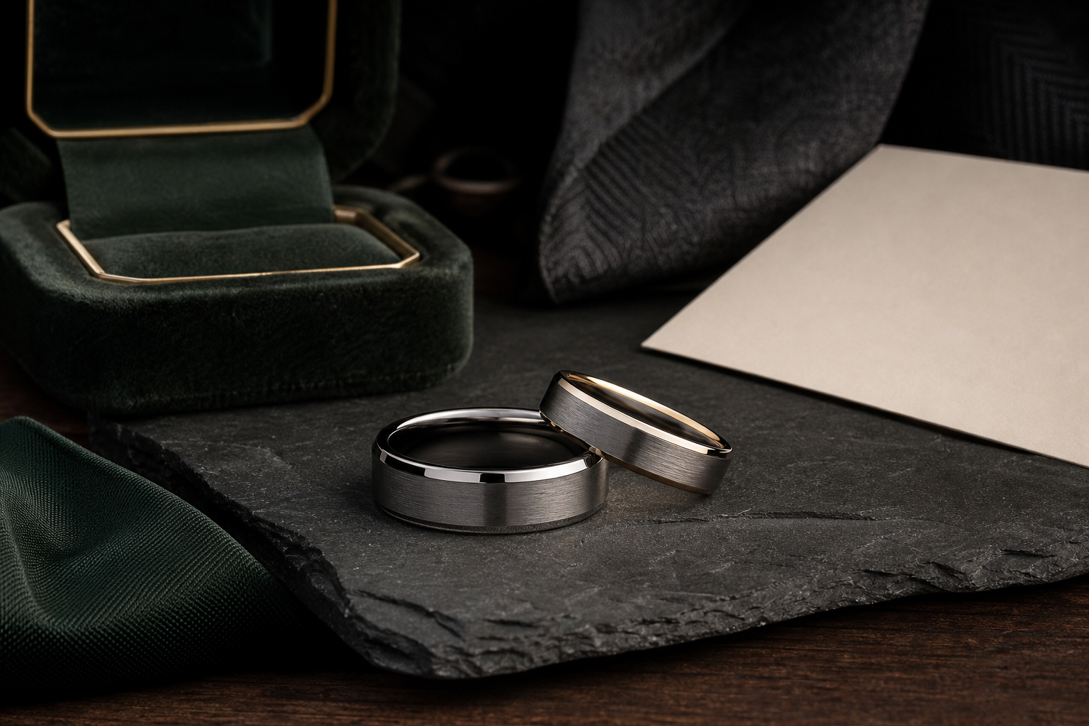
silver, black, brushed, polished, and tungsten-style bands all change how formal or understated the engraving feels. Consider how the finish will hold up after months of regular wear, not only on day one.
choose language that belongs to the couple rather than a line copied from a wedding engraving list. Fewer words usually engrave more clearly than a full sentence.
confirm date format, spelling, coordinates, handwriting source, and any symbol reference before final artwork. A clean source file gives the designer more room to preserve the detail that matters.
use one shared marriage detail and one supporting anchor such as initials, date, or place. Supporting details should clarify the main idea, not decorate around it.
Common mistakes here: avoid designing only for the reveal photo if the band needs to feel natural years later. Small curved metal shows clutter faster than a flat mockup ever will.
Decide whether the engraving should be private, visible, romantic, formal, or quietly practical. Everything else here exists to help answer that one question.
When ready, bring the shared phrase, date, initials, coordinates, source files, and story note into the Friends of Irony designer.